Likewise
Likewise is a charity with a long history of supporting adults in north London and a bold vision for improving social care. Alongside a flexible one-to-one client-centred support service, it also operates a community center running a programme of activities aimed at bringing together members of the local community
After the charity rebranded in the spring of 2019 from it's previous identity as Holy Cross Centre Trust, I began working with Likewise as its in-house graphic designer
Building from 'look-and-feel' brand guidelines, I have started to develop and implement a consistant typographic system and a flexible house style suitable for the charity's varied printed and digital touch-points such as a reports, promotional materials and the Likewise website

Impact and Learning Evaluation Report
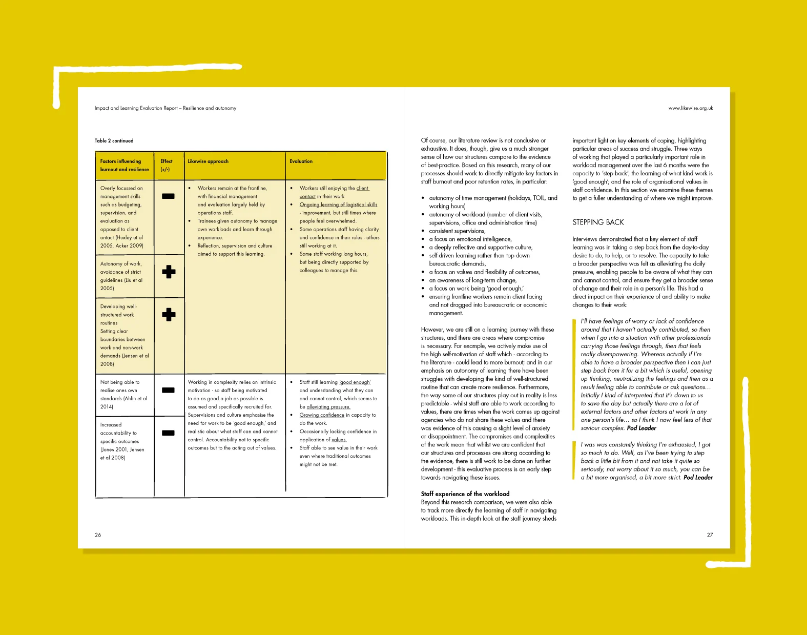
A key part of Likewise's work is its research and development of a new, flexible approach to adult social care. As part of that work, the charity publishes a bi-annual evaluation report on the impact and effectiveness of its approach
Primarily written for stakeholders and decision-makers, the design of the reports adopts a serious tone, with a conservative use of colour and illustrated elements


Healthy Minds Academy: Year 2 Report
In partnership with Camden Council, Likewise runs the Healthy Minds Academy – a training scheme giving volunteers from a diverse range of backgrounds the opportunity to experience and learn about working in social care. As part of that partnership, Likewise publishes an internal annual report about the Academy for the council's consideration
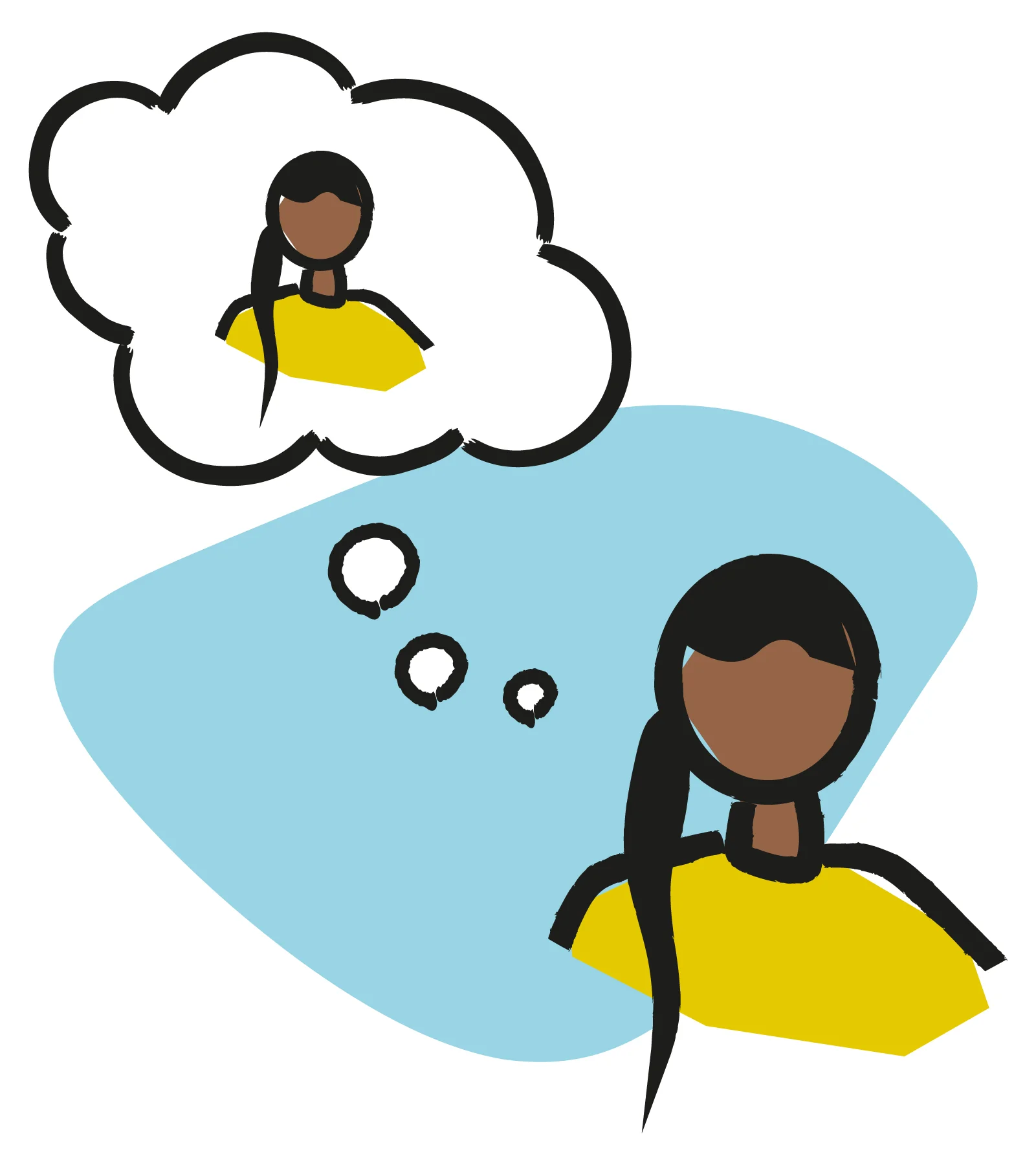
As with the Impact and Learning evaluation, the Healthy Minds Academy report takes a considered approach to its design. A more playful approach to its use of imagery and illustration, especially as a part of information graphics, reflects the slightly less corporate audience of this report


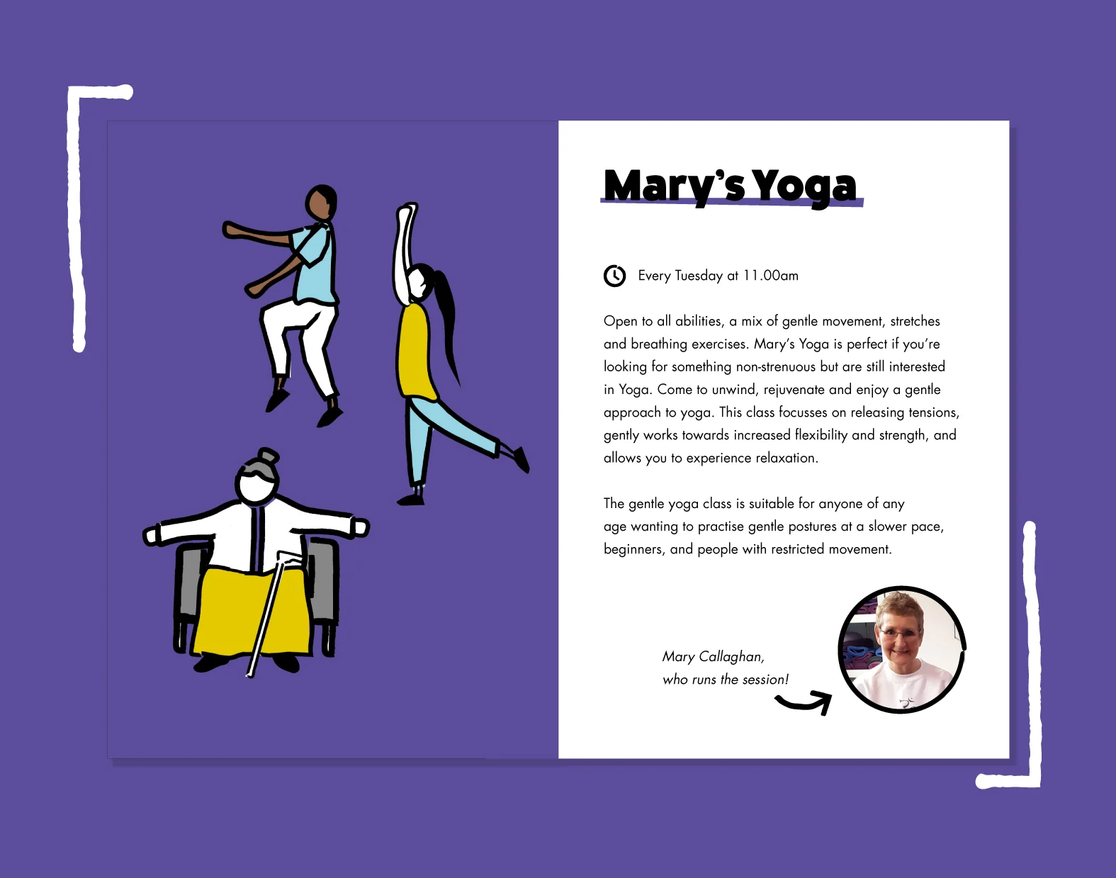
What's on at Likewise
From its base at the Likewise Hub in Camden the charity runs a varied programme of free activities for members of the local community to come together and get involved in. To help promote these activites, I designed a pocket-sized booklet to be distributed in cafes, libraries and other similar places in the neighbourhood
A playful use of colour and illustration defines Likewise's promotional materials from the more serious design of its reports, whilst a consistant use of typography across the system works to unite the two design aesthetics under a single brand


Likewise Support
Promoting its flexible one-to-one client-centered support service to potential service users, this flyer sits somewhere between the two poles of a report and event publicity. A considered yet playful design approach reflects this, creating a welcoming but professional aesthetic